 E-Commerce
Fashion & Apparel
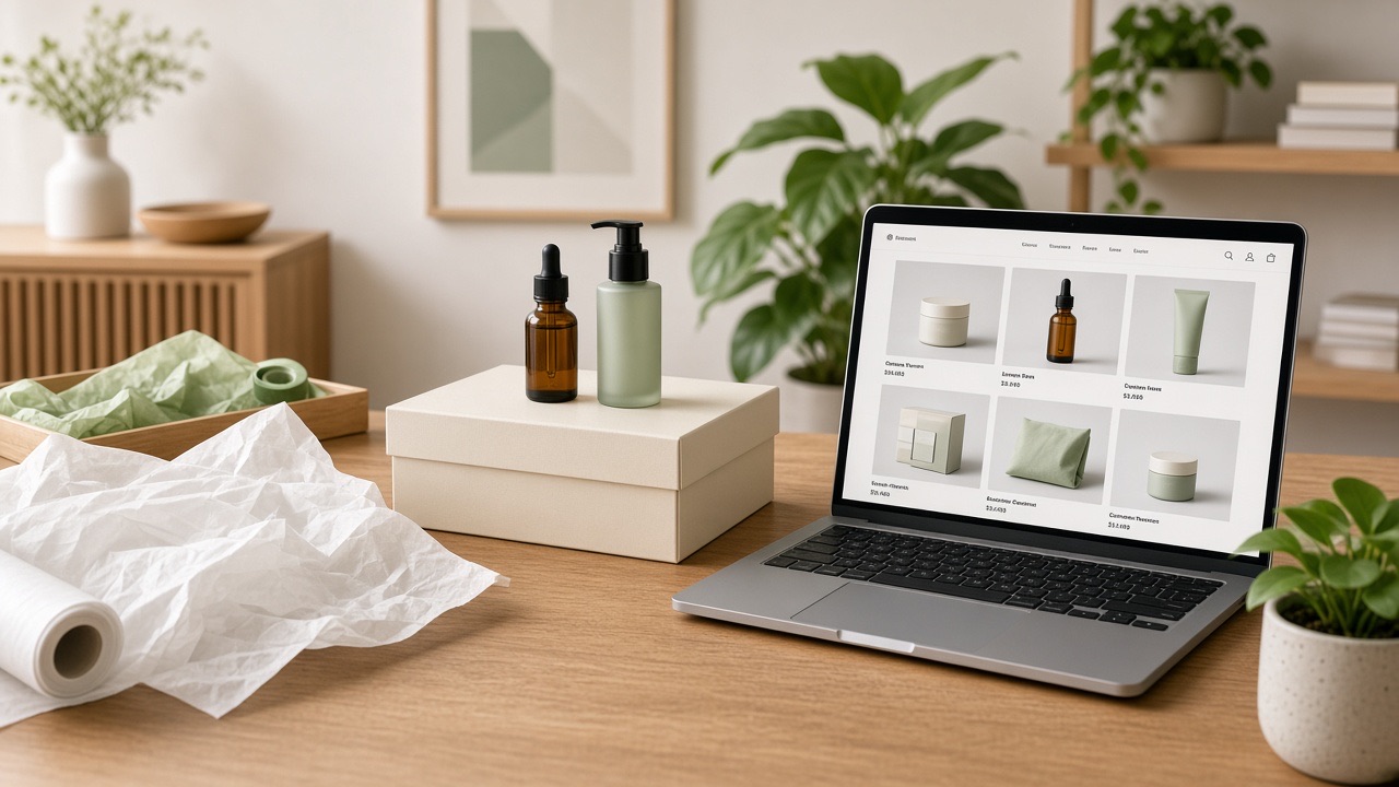
WordbitX DemoFashion Shopify Storefront
A WordbitX demo of a Shopify storefront with fast collection browsing, size-aware product pages and a streamlined mobile checkout.
ShopifyJavaScriptTailwind CSSStripe
View ProjectResearch-led interface design, design systems and brand visuals that make complex products feel simple.
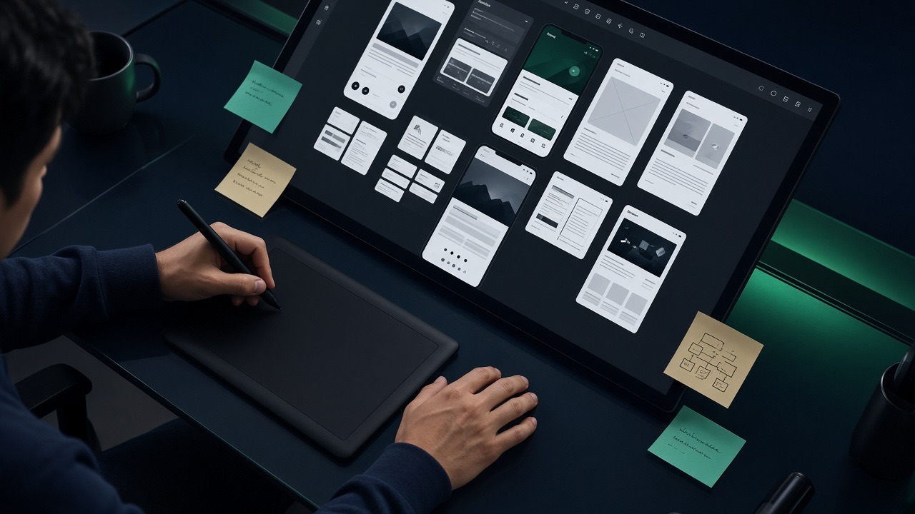
Design decides whether people finish what they started on your product. WordbitX approaches design as problem solving: understand the user's goal, remove the steps that do not serve it, and make the remaining path obvious.
Every project ends with a design system — tokens, components, states and usage rules — so engineering builds faster and future screens stay consistent instead of drifting.
These are the recurring issues clients bring us before this work starts.
Unclear labels and hidden actions cause abandonment. Usability testing exposes exactly where people stall.
Every screen looking different erodes trust and slows development. A design system fixes it at the source.
Pretty files that ignore technical constraints get rebuilt badly. Our designers work alongside engineers.
Simplified flows increase signups, checkouts and form submissions.
Reusable components and documented states reduce build and QA time.
Colour contrast, focus states and keyboard navigation included, not optional.
One visual language across website, app, dashboard and marketing assets.
Heuristic reviews, journey maps, analytics analysis and usability testing.
High-fidelity screens for web, mobile and dashboards with full responsive states.
Figma libraries with tokens, components and documentation.
Logos, brand guidelines, pitch decks, social kits and marketing collateral.
Each stage produces something you can review, so there are no surprises at handover.
Users, competitors, analytics and business constraints.
Information architecture, user flows and low-fidelity wireframes.
Brand-aligned UI, states, motion notes and responsive layouts.
Clickable prototype validated with real users, then refined.
System documentation and active support during development.
Chosen per project based on your team, budget and long-term maintenance needs.
Practical commitments, not slogans.
We measure success by task completion, not by how the mockup looks in a slide.
Designs are reviewed for feasibility before they reach development.
You get a reusable library, not a folder of one-off artboards.
WCAG-aligned contrast, sizing and focus behaviour as standard.
Detailed profiles of the scope, architecture and outcomes.
E-CommerceFashion & Apparel
WordbitX DemoA WordbitX demo of a Shopify storefront with fast collection browsing, size-aware product pages and a streamlined mobile checkout.
 Websites
Healthcare
A booking portal with doctor schedules, slot management, reminders and an admin console for reception teams.
DesignFinancial Services
A redesigned onboarding and transaction experience supported by a documented Figma design system for a financial application.
Straight answers to what clients ask before starting this type of project.
Yes. Design-only engagements are common — you receive Figma files, a documented design system and developer handoff specs your in-house team can implement.
Yes. We start with a UX audit and analytics review, then redesign in phases so users are not disrupted by a sudden change.
Two structured rounds per milestone are standard. Feedback is collected in one place so decisions stay clear and timelines hold.
Programmes usually combine two or three of these.
 Web Development
The questions that separate a partner from a vendor: ownership, performance budgets, SEO handling, communication cadence and what happens after launch.
Read More Mobile Apps
What actually drives mobile app cost — scope, platform choice, backend complexity and post-launch work — plus a realistic way to budget your first release.
Read MoreSend us your requirements and we will reply with an approach, milestone plan and realistic timeline for ui/ux & graphic design.
Typical reply time: same business day. We work with clients across Pakistan, the UK, US, UAE and Australia.